17/03/11
Today we had our second of the short assignments from last week, this week I chose to the of RECESSION. I remembered reading that the Yorkshire area had some of the highest percentages of empty shops. To find out more have a look here
http://www.guardian.co.uk/business/2011/feb/15/empty-shops-killing-uk-high-streets
I chose to focus my photographs on to let or for sale signs to give the impression of the recession, here are my images.


I chose to saturate all the colours but the red because the red was the most prominant colour on the for sale signs. Also in the post office photograph above the red runs through the post office sign and the post box which I felt linked it all together.
10/03/11
Today we were given a set of words with their definitions, from this we had to chose one and take to photographs that represented it. I chose the word BLACK which was defined as "being characterized by absence of light; enveloped in darkness."
I wanted my first photograph to represent the colour of black and look at the variations of the colour BLACK that there are. I chose to photograph a metal bin as the outside of it was a different BLACK to the inner bin, after I took the photograph I also noticed there are many variations of BLACK all over the metal.

The phrase 'absence of light' was my inspiration for my second photograph. I thought as the medium f photography is based around light I could create an absence of light on a bright day. I chose to under expose this photograph o capture an absence of light, the foreground of the statue is completely BLACK due to the absence of light.

I am very happy with both my images and I think this could be a project I could investigate further, I think a series of different underexposed objects could be quite interesting.
17 February 2011
Today we were set a new short assignment, we each took a word and had to take a photograph which represents it. My word was Empty, at first I thought this would be easy as there are plenty of empty objects around. However when I started to think about it more a lot of empty things could have other more obvious meanings. An example of this problem could be that a street without people or cars/vans etc could be seen as being empty but is more likely to be seen as deserted.
I eventually decided to photograph the river using a 10-20mm lens, the weather today was very misty and cloudy on the river, so the sky was empty, there were no birds or individual clouds or the sun. I then chose a place to take the photograph where there were not any buoys or boats. This is my photograph, I feel it represents empty.

If I was to take another photograph to represent empty I would take a busy street using a long shutterspeed until everyone became invisible. I think this idea would give a twist on the idea of an empty street.
3 February 2011
Today I attempted the Hull Fashion Assignment.
Hull has been described as 'The worst dressed city in England'. I was required to photograph a few people I didn't know and find out where they bought their clothes from.
These are the photographs I took;


24 November 2010
For this short assignment I decided to do the 'Building bricks' option, which asks to photograph several small sections of a favourite building that best illustrate its distinguishing feature. The building must be recognisable to those who know it.
I have chosen a building in Hull City Centre that is very popular and used a lot. I think this building has interesting architecture and is quite modern compared to the rest of the City. This is probably the building I spend most of my time in when I'm out and about, can you guess what building it is?


I photographed a shopping centre but deliberately decided not to show any shops as I felt the building itself is easily recognisable. I am very happy with this set of photographs, it was nice to have a little break from photographs that have people in them.
The second short assignment I have done this week is 'Keep it simple', we are to take 5 images on the minimalist style of Michael Kenna.
For this assignment I started by looking at some Michael Kenna's work on his website, http://www.michaelkenna.net/imagearchive.php.
I decided to do all 5 of my photographs along the River Humber, I wanted to use slow shutter speeds to create a minimalist feel so I went at dusk to get darker lighting conditions. I wanted to look at objects along the river that are solitary to keep in with the minimalist theme.


In photoshop I tweaked the tonal range slightly and desaturated them all so the would all look similar. Kenna also used a lot of greyscale within his images.
I enjoyed this project a lot, I would definitely revisit this idea in the future as I really like the final result. I would like to try different areas to see how I could make a busy cluttered area appear minimalistic.
05 November 2010
Yesterday we were given two more short assignments to do. This time they were studio based looking at lighting. The first of which was to take two images illustrating dark field lighting and bright field lighting, we were told to look at the images on the links below and recreate the same lighting.
http://www.flickr.com/photos/14599517@N08/5144391690/
http://www.flickr.com/photos/14599517@N08/4386071690/
I worked in a group of two, to start with we tried using two soft boxes either side of the glass, this method I used last year when lighting bottles. However this did not work as it gave too many reflections of the soft boxes. We then conducted research using Light, Science and Magic (Hunter Biva Furga, 3rd edition) in here we found two different methods of creating dark field lighting. We decided to try a different one each, I went for the method of using two soft boxes facing a white background with the glass quite far away. I then placed black card behind the glass filling the view finder on the camera. This method allowed light to be bounced off the soft box on to the edges of the glass without creating unwanted reflections. This is what the set up looked like;

This is the finished photograph;
13 October 2010
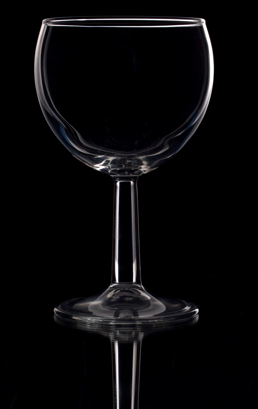
I am very happy with this photograph I feel the edges are lit nicely and the surrounding area is black. I quite like the reflection created by placing the glass on a mirror. If I was to do this in the future I would definitely use this method but I would also perhaps try some other techniques to see which one works best.
We then moved on to the bright field lighting,for my set up I placed the glasses on a mirror, which was then put on a white product table. I used a standard head reflector from behind the product table to light the glasses. This eliminated any unwanted reflections on the glasses and gave quite even lighting. This is the set up for this photograph;
We then moved on to the bright field lighting,for my set up I placed the glasses on a mirror, which was then put on a white product table. I used a standard head reflector from behind the product table to light the glasses. This eliminated any unwanted reflections on the glasses and gave quite even lighting. This is the set up for this photograph;


This is the finished photograph;

I am very pleased with this photograph, I think the bright field lighting works well with the subject, I also like the black edges of the glasses as this gives them shape. One thing I would change if I were to do this again would be to move the glasses further back on the mirror as I think the line in the background looks a bit high compared to the glasses, I could also change the angle of the camera to accomplish this.
The second task we chose was Glossy Back. Using the same background material for both shots we had to change the appearance of it using lighting. the two example we were given are on the links below.
http://www.flickr.com/photos/14599517@N08/4385307955/
http://www.flickr.com/photos/14599517@N08/4385307877/in/photostream/
For both of these photographs I used the same set up and I just changed the angle of the light to change the look of the background. I also used the same plastic black background for both shots. With the lit background I used one large soft box above the decoration as I wanted to reflect the soft box completely in the background. This is photograph shows the set for this image;

This is the final photograph:

I think the decoration and its reflection looks good against the light background, I feel this photograph meets the brief. The main problem I had with the photograph was getting all of the decoration in without losing some of the background as the plastic I was using was a bit too small. If I was to do this again I would used a larger piece of reflective surface.
I then used the same set up but by moving the soft box and changing its angle I created a completely different look. I also experimented with the decoration on its side to make it easier to capture all of the decoration in the frame. However once I looked at both sets I preferred the tree standing up. This photograph shows the new set up;

This is the final photograph;

13th October
Today I posted my final selection for this brief. I have chosen to create my photographs using my car as the subject. The link to the bicycle photographs really inspired me. I like the way the photographer has chosen to photograph parts of the bicycle that are well known and easily recognised. I have to photographed the easily recognisable parts of a car; i.e. steering wheel, gear stick. As well as other not so recognisable parts.
After looking at my photographs I saw the same shape reappearing in a lot of the photographs, this shape is a circle. I feel the circle represents one of the most important components of a car... the wheels, so I have chosen my final photographs around this idea.


07 October 2010
Today I received the first of my short assignments.
I have chosen to try the 'Close Up' option -
Choose a subject. Study it. Take 10 photographs of it.
I have looked at http://photographers-toolbox.com/products/elegance/bicycle/ to gain an idea of work that has been created for this brief.
No comments:
Post a Comment